

Conversion Optimization: Turn Website Visitors Into Customers
Step-by-step guide to optimizing landing pages, contact forms, and sales funnels. Delhi businesses increased conversions by 45–60%.
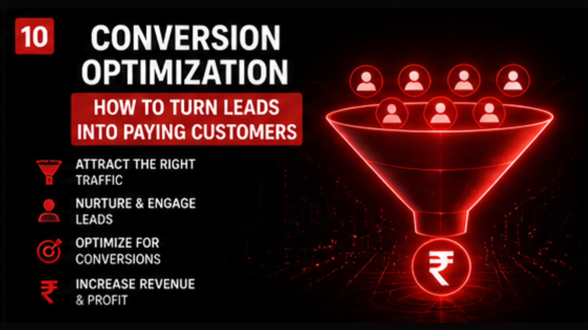
You're spending ₹50K monthly on ads. Getting 500 visitors. Converting 2 (0.4%). That's ₹25K per customer.
Your competitor spends ₹50K, gets 400 visitors, converts 40 (10%). That's ₹1.25K per customer.
Same budget. Same traffic source. 10× better ROI. How?
Conversion optimization.
The Conversion Optimization Funnel (5 Stages)
Stage 1: Landing Page (The First 3 Seconds)
Visitor lands on your page. They have 3 seconds to decide: "This is relevant" or "Back to Google."
Critical elements:
- Headline: Must match the ad they clicked. If ad says "Free trial," headline must confirm: "Get Your Free 7-Day Trial."
- Subheading: Clarify the benefit. "No credit card required. No long-term commitment."
- Hero image/video: Shows the result or product in action.
- Mobile responsive: 60% of Delhi traffic is mobile.
Test these: Single image vs. video hero. Benefit-focused headline vs. curiosity-focused. Short vs. long copy.
Stage 2: Social Proof (Build Trust)
After headline, visitors ask: "Is this legit?"
What converts:
- Client logos (company brands they recognize)
- Testimonials with face + name + result
- Star ratings (4.8/5 ⭐)
- Number of customers served ("Trusted by 5,000+ coaches")
- Case study with numbers ("Generated ₹50L in revenue")
Best practice: Add social proof immediately after headline. Don't wait until they scroll.
Stage 3: The Offer (Clear Value Proposition)
What are you asking them to do?
- "Download free guide"
- "Book free consultation"
- "Start free trial"
- "Buy now"
The offer must be:
- Specific: "Free trial" is vague. "7-day free trial, no credit card, cancel anytime" is specific.
- Low friction: Free > Cheap > Premium
- Relevant: Match the pain point from the ad
Stage 4: The Form (Minimize Friction)
Most forms lose 50% of people just because they're too long.
Best practices:
- Ask only what you need: Name, email, phone. That's it. Don't ask age, company size, revenue until they're warm.
- Progressive profiling: Ask 2–3 fields now. More questions after they convert.
- Single-column layout: Easier on mobile.
- Clear button: "Get My Free Trial" (action-focused), not "Submit" (boring).
- Trust badges: "Your info is secure. No spam."
Form length impact:
- 2 fields: 25% conversion
- 3 fields: 20% conversion
- 5 fields: 12% conversion
- 7+ fields: 5% conversion
Stage 5: Post-Conversion (Thank You Page + Automation)
They submitted the form. Now what?
Immediate actions:
- Show "Success!" message with next steps
- Send instant email confirmation + download link (if applicable)
- Send WhatsApp message (if phone number collected)
- Schedule a follow-up call (if sales offer)
Example sequence:
Visitor fills form → "Thanks! Check your email for your free guide" → Email arrives in 2 mins with guide + appointment link → If no click in 24 hours, WhatsApp reminder → 48 hours, phone call
A/B Testing: The Conversions Multiplier
Test ONE variable at a time:
- Week 1: Test headline (version A vs. version B, 50/50 traffic split)
- Week 2: Test CTA button color (red vs. blue)
- Week 3: Test form length (3 fields vs. 5 fields)
- Week 4: Test hero image (photo vs. video)
Measure: Conversion rate for each version. Winner stays. Loser is replaced next week.
Real example: Changing CTA button from "Submit" to "Get My Free Trial" increased conversions by 12%. Small change. Big impact.
The Numbers: What Healthy Conversion Looks Like
Industry benchmarks (Delhi):
- Landing page conversion: 5–15% (poor 2–4%, good 5–10%, excellent 15%+)
- Lead-to-consultation: 40–60%
- Consultation-to-customer: 25–40%
- Overall: Visit to customer: 1–3%
If you're at 0.5%, you have optimization work to do. If you're at 3%+, you're beating competitors.
Quick Conversion Audit Checklist
- ☐ Headline matches ad copy
- ☐ Subheading clarifies the benefit
- ☐ Hero image/video is present
- ☐ Social proof visible (testimonials, logos, numbers)
- ☐ Clear offer (not vague)
- ☐ Form has ≤3 required fields
- ☐ CTA button is high-contrast color (red, green)
- ☐ Thank you page confirms next steps
- ☐ Mobile version is responsive
- ☐ Auto-reply email sent immediately
Real Delhi Example
Before optimization: A real estate agent's landing page got 300 visitors/month, 3 leads (1% conversion).
Issues found: Form had 7 fields. Headline was generic. No testimonials. Button was gray.
Changes made:
- Reduced form to 3 fields
- Changed headline to "Free Property Evaluation for Delhi Buyers"
- Added 3 client testimonials with photos
- Changed button to red "Get My Free Evaluation"
After 2 weeks: Same 300 visitors/month, 30 leads (10% conversion).
Impact: 10× more leads from same traffic. ROI multiplied by 10×.
Ready to Optimize Your Conversions?
Our Funnel Building and Analytics experts will audit your landing pages and identify 3–5 quick wins to boost conversions by 20–50%.
Get Your Free Conversion Audit →Related Articles
- How Gyms Generate 100+ Leads Every Month Using Meta Ads — Proven lead funnel system
- Meta Ads vs Google Ads: What Works Best in Delhi NCR? — Platform strategy
- Top Mistakes Brands Make in Paid Advertising — Avoid conversion killers